Native Internet User Interface 3.0
Lightweight, featureful front end for the web
- niui.min.css
- niui.min.js
- Lightweight
- ES module
- Accessible
- Feature-packed
- Dozens of demo pages
- Progressive enhancement
- WordPress theme
- No dependencies
- Style agnostic
- Prefixed BEM CSS classes
- Nestable components
- Dynamic init
- RTL ready
- Unbreakable
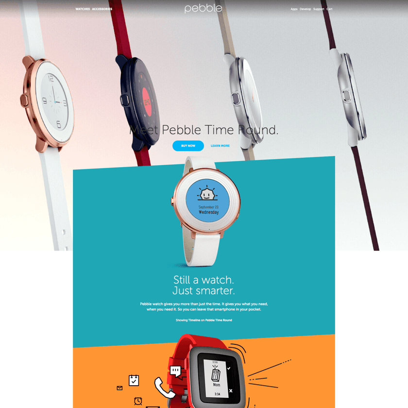
Reimplemented real world examples


%20imperial%20-.png)
%20-.png)
Developed by Radoslav Sharapanov since 2014.
Contribute at OpenCollective or buy me a beer at Revolut or PayPal.
Usage
Get niui.min.css
niui.min.js
and index.html
and edit the latter.
Or install with NPM and include the niui files
npm i --save-dev niui-npm<link rel="styleSheet" href="./node_modules/niui-npm/dist/niui.min.css" type="text/css"><script src="./node_modules/niui-npm/dist/niui.min.js" type="module"></script>import nui from './node_modules/niui-npm/js/niui.js';To customize the bundle, remove anything unnecessary from components/ and run
npm i --legacy-peer-deps
./build.sh
Page structure
Minimal
<!DOCTYPE html>
<html>
	<head>
		<link rel="styleSheet" href="niui.min.css" type="text/css">
		<script src="niui.min.js" type="module" defer></script>
	</head>
	<body>
		<main>
			Content
		</main>
	</body>
</html>
Recommended
<!DOCTYPE html>
<html>
	<head>
		<meta charset="utf-8">
		<meta name="viewport" content="width=device-width, initial-scale=1.0, maximum-scale=5, user-scalable=yes, viewport-fit=cover">
		<link rel="styleSheet" href="niui.min.css" type="text/css" media="screen">
		<script src="niui.min.js" type="module" defer></script>
	</head>
	<body class="n-type">
		<header class="n-header">
			Header
		</header>
		<main>
			Content
		</main>
		<footer class="n-footer">
			Footer
		</footer>
	</body>
</html>
Options
-
.n-viewport
– full viewport height section - Use
.n-section
containers in<main>
to clear inner vertical margins -
body.n-sticky-footer
for a sticky footer and vertical space taken by<main>
. -
html.n-vertical-page
blocks horizontal overflow.
Grid
Columns with classes like _1/3 inside a container of class n-row
_1/5
_4/5
_1/4
_3/4
_1/3
_2/3
_2/5
_3/5
_1/2
_1/2
_1/1
<div class="n-row">
	<div>
		<div>...</div>
	</div>
	<div class="_1/3">
		<div>...</div>
	</div>
</div>
Alignment
<div class="n-row">
	<div>
		<div>Left Top<p><br></p></div>
	</div>
	<div class="n-center">
		<div>Center Top</div>
	</div>
	<div class="n-right">
		<div>Right Top</div>
	</div>
	<div class="n-middle">
		<div>Left Middle</div>
	</div>
	<div class="n-bottom">
		<div>Left Bottom</div>
	</div>
	<div class="n-center n-middle">
		<div>Center Middle</div>
	</div>
	<div class="n-right n-middle">
		<div>Right Middle</div>
	</div>
	<div class="n-center n-bottom">
		<div>Center Bottom</div>
	</div>
	<div class="n-right n-bottom">
		<div>Right Bottom</div>
	</div>
	<div>ThisLineIsTooLongAndMustBeClippedByTheContainerEvenThoughOverflowXandYDontWorkAsExpected</div>
</div>
Grid without column padding
<div class="n-row n-row--no-padding">
	<div>
		<div>...</div>
	</div>
</div>
Grid without column margin (gutter)
<div class="n-row n-row--no-margin">
	<div>
		<div>...</div>
	</div>
</div>
Grid without spacing
<div class="n-row n-row--no-spacing">
	<div>
		<div>...</div>
	</div>
</div>
Embedded grid
<div class="n-row">
	<div>
		<div class="n-row">
			<div>Child grid column</div>
			<div>Child grid column</div>
		</div>
	</div>
	<div class="_1/3">
		<div>Parent grid column</div>
	</div>
</div>
Embedded grid without extra spacing
<div class="n-row">
	<div>
		<div class="n-row n-unpad">
			<div>Child grid column</div>
			<div>Child grid column</div>
		</div>
	</div>
	<div class="_1/3">
		<div>Parent grid column</div>
	</div>
</div>
Grid with borders
Grid with borders
<div class="n-row n-row--border">
	<div>...</div>
</div>
Grid with all borders
<div class="n-row n-row--border-all">
	<div>...</div>
</div>
Right to left layout
centered
<div dir="rtl">
	...
</div>
Options
- Column class is optional. Minimum width 20%.
-
.n-row > div > .n-row--vertical.n-row
– a vertical row as tall as the parent row with equal-height full-width children. - By default, all images inside a grid are limited to 100% width.
- A column with
.n-full-mobile-width
will take the full mobile width.
Typography
For niui typography features like baseline alignment, wrap the below elements inside an .n-type container.
Headlines
Headline 1
Headline 2
Headline 3
Headline 4
Headline 5
Headline 6
Headlines use padding instead of margin, to take up vertical space divisible by page line height.
Quote
The sky above the port was the color of television, tuned to a dead channel.
<q>
	...
</q>
Drop cap
Call me Ishmael. Some years ago - never mind how long precisely - having little or no money in my purse, and nothing particular to interest me on shore, I thought I would sail about a little and see the watery part of the world.
<p class="n-drop-cap">
	...
</p>
Links
Here is a first link.
Paragraph
Text elements are baseline-aligned with height divisible by the default line height. Lorem ipsum dolor sit amet, consectetur adipisicing elit, sed do eiusmod tempor incididunt ut labore et dolore magna aliqua. Ut enim ad minim veniam, quis nostrud exercitation ullamco laboris nisi ut aliquip ex ea commodo consequat.
Height compensation according to line height

<span class="n-adjust-height">
	...
</span>
To avoid shifting on page load, add niui-preload.min.js in <head>.

Fixed background
<div class="n-fixed-bg">
			<picture class="n-fixed-bg__backdrop"><img></picture>
			...
		</div>
The background image takes up the full browser window and is visible only through the .n-fixed-bg section.
Aspect ratio container
As the image is loading, the layout is already solid and the page doesn't jump after the download.
<picture class="n-aspect" style="--width: 1600; --height: 681;">
	<img src="images/lido.jpg" alt="Lido" width="1600" height="681">
</picture>
Options
- If the element has inline style --ratio, the --width/--height combination is ignored.
- The container can be a div and the content doesn't need to be an image.
Standard
One
Two
<div class="n-carousel">
	<div class="n-carousel__content">
		<div>Slide 1</div>
		<div>Slide 2</div>
	</div>
</div>
Index
One
Two
<div class="n-carousel">
	<div class="n-carousel__content">
		<div>Slide 1</div>
		<div>Slide 2</div>
	</div>
	<div class="n-carousel__index">
		<button><span>1</span></button>
		<button><span>2</span></button>
	</div>
</div>
Vertical
One
Two
<div class="n-carousel n-carousel--vertical">
	<div class="n-carousel__content">
		<div>Slide 1</div>
		<div>Slide 2</div>
	</div>
	<div class="n-carousel__index">
		<button><span>1</span></button>
		<button><span>2</span></button>
	</div>
</div>
Vertical with controls on the right
One
Two
<div class="n-carousel n-carousel--vertical n-carousel--index-end">
	<div class="n-carousel__content">
		<div>Slide 1</div>
		<div>Slide 2</div>
	</div>
	<div class="n-carousel__index">
		<button><span>1</span></button>
		<button><span>2</span></button>
	</div>
</div>
Controls outside of content
One
Two
<div class="n-carousel n-carousel--controls-outside">
	<div class="n-carousel__content">
		<div>Slide 1</div>
		<div>Slide 2</div>
	</div>
	<div class="n-carousel__index">
		<button><span>1</span></button>
		<button><span>2</span></button>
	</div>
</div>
Peeking at neighboring slides
One
Two
<div class="n-carousel n-carousel--peek">
	<div class="n-carousel__content">
		<div>Slide 1</div>
		<div>Slide 2</div>
	</div>
	<div class="n-carousel__index">
		<button><span>1</span></button>
		<button><span>2</span></button>
	</div>
</div>
Auto height
One
Two
<div class="n-carousel n-carousel--auto-height">
	<div class="n-carousel__content">
		<div>Slide 1</div>
		<div>Slide 2</div>
	</div>
</div>
Carousel with detached nav
Carousel here...
One
Two
<div class="n-carousel" id="detached-carousel">
	<div class="n-carousel__content">
		<div>Slide 1</div>
		<div>Slide 2</div>
	</div>
</div>

<div class="n-carousel__previous" data-for="detached-carousel">
	<button><span>Previous</span></button>
</div>
<div class="n-carousel__next" data-for="detached-carousel">
	<button><span>Next</span></button>
</div>
<div class="n-carousel__index" data-for="detached-carousel">
	<button><span>1</span></button>
	<button><span>2</span></button>
</div>
...detached nav here
Options
- Custom slide duration
<div class="n-carousel" data-duration="1">
in seconds.. - URI with hash matching a slide ID in a carousel, auto slides to it.
-
--peek: 20%
to peek at neighboring slides, where 20% becomes 20% horizontal padding -
.n-carousel.n-carousel--auto-slide
auto slides the carousel. Usedata-interval="4"
to specify the interval between slides, in seconds. - Vertical carousels require either
--max-height
(defaulting at 75vh) or.n-carousel--auto-height
.
Tabs at the bottom
-
Tab 1
Content of Tab 1
-
Tab 2
The content of Tab 2
New line
New line
-
Three
<div class="n-carousel n-carousel--tabs n-carousel--controls-outside">
	<div class="n-carousel__content">
		<div> Tab 1 </div>
		<div> Tab 2 </div>
	</div>
	<div class="n-carousel__index">
		<button><span>Tab 1</span></button>
		<button><span>Tab 2</span></button>
	</div>
</div>
Tabs on top with auto height
-
Tab 1
Content of Tab 1
-
Tab 2
The content of Tab 2
New line
New line
-
Three
<div class="n-carousel n-carousel--tabs n-carousel--auto-height n-carousel--index-start n-carousel--controls-outside">
	<div class="n-carousel__content">
		<div> Tab 1 </div>
		<div> Tab 2 </div>
	</div>
	<div class="n-carousel__index">
		<button><span>Tab 1</span></button>
		<button><span>Tab 2</span></button>
	</div>
</div>
Vertical tabs
-
Tab 1
Content of Tab 1
-
Tab 2
The content of Tab 2
New line
New line
-
Three
<div class="n-carousel n-carousel--tabs n-carousel--vertical n-carousel--controls-outside">
	<div class="n-carousel__content">
		<div> Tab 1 </div>
		<div> Tab 2 </div>
	</div>
	<div class="n-carousel__index">
		<button><span>Tab 1</span></button>
		<button><span>Tab 2</span></button>
	</div>
</div>
Vertical tabs on the right
-
Tab 1
Content of Tab 1
-
Tab 2
The content of Tab 2
New line
New line
-
Three
<div class="n-carousel n-carousel--tabs n-carousel--vertical n-carousel--index-end n-carousel--controls-outside">
	<div class="n-carousel__content">
		<div> Tab 1 </div>
		<div> Tab 2 </div>
	</div>
	<div class="n-carousel__index">
		<button><span>Tab 1</span></button>
		<button><span>Tab 2</span></button>
	</div>
</div>
Tabs at the bottom with detached nav
-
Tab 1
Content of Tab 1
-
Tab 2
The content of Tab 2
New line
New line
-
Three
<div class="n-carousel n-carousel--tabs" id="detached-tabs">
	<div class="n-carousel__content">
		<div> Tab 1 </div>
		<div> Tab 2 </div>
	</div>
</div>
<div class="n-carousel__index n-carousel--tabs" data-for="detached-tabs">
	<button><span>Tab 1</span></button>
	<button><span>Tab 2</span></button>
</div>Options
- This component inherits the carousel
Inline
-

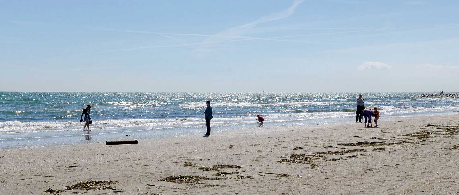
First Taipei photo -

First Taipei photo -

First Taipei photo


<div class="n-carousel n-carousel--lightbox n-carousel--inline n-carousel--thumbnails">
<ul class="n-carousel__content">
<li>
<figure>
<picture>
<img width="1365" height="2048" src="DSC00756.jpg" loading="lazy">
</picture>
<figcaption>A city skyline</figcaption>
</figure>
</li>
...
</ul>
<div class="n-carousel__index">
<button><img src="DSC00756-88x88.jpg" alt="Thumbnail of a city skyline"></button>
...
</div>
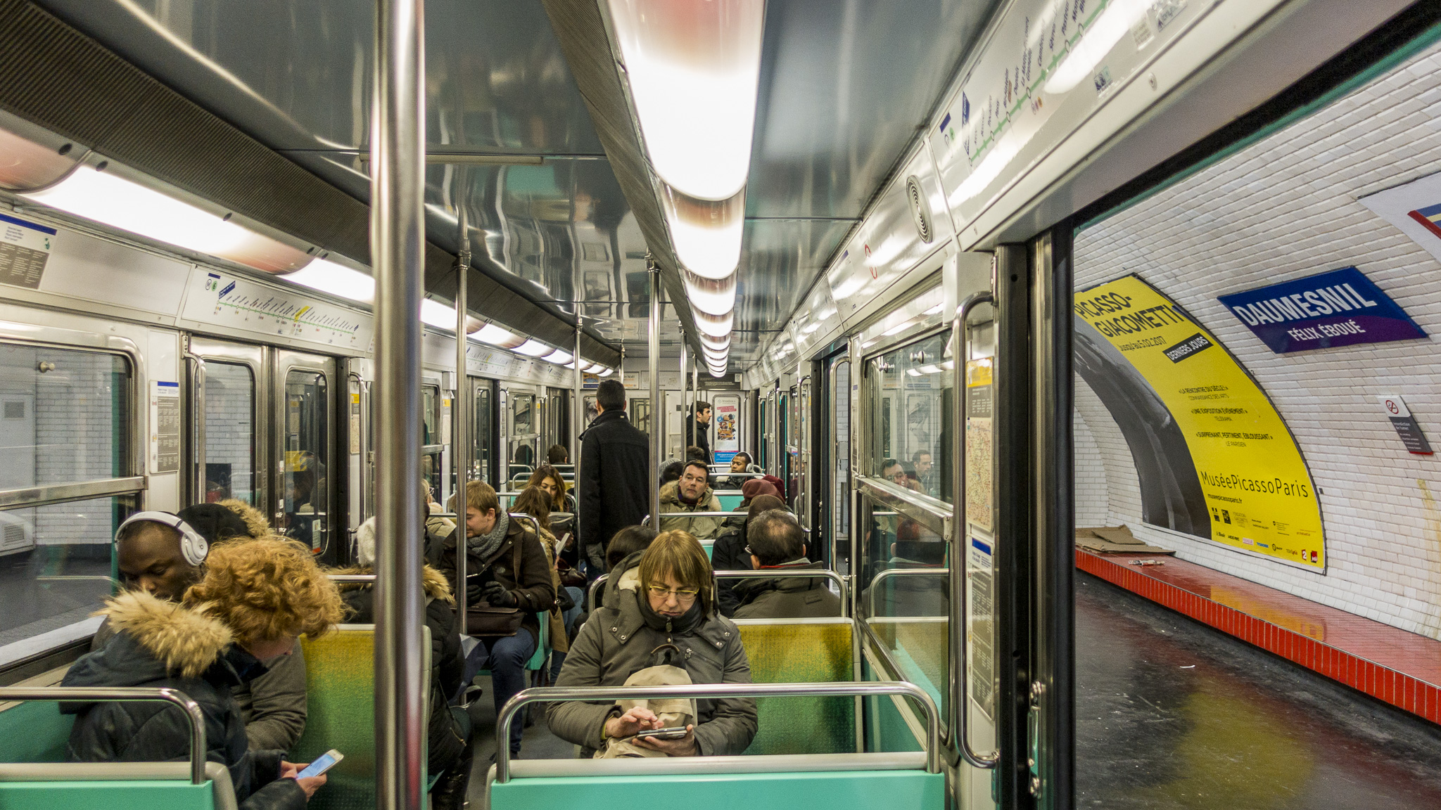
</div>Inline vertical
-

First photo from Japan -
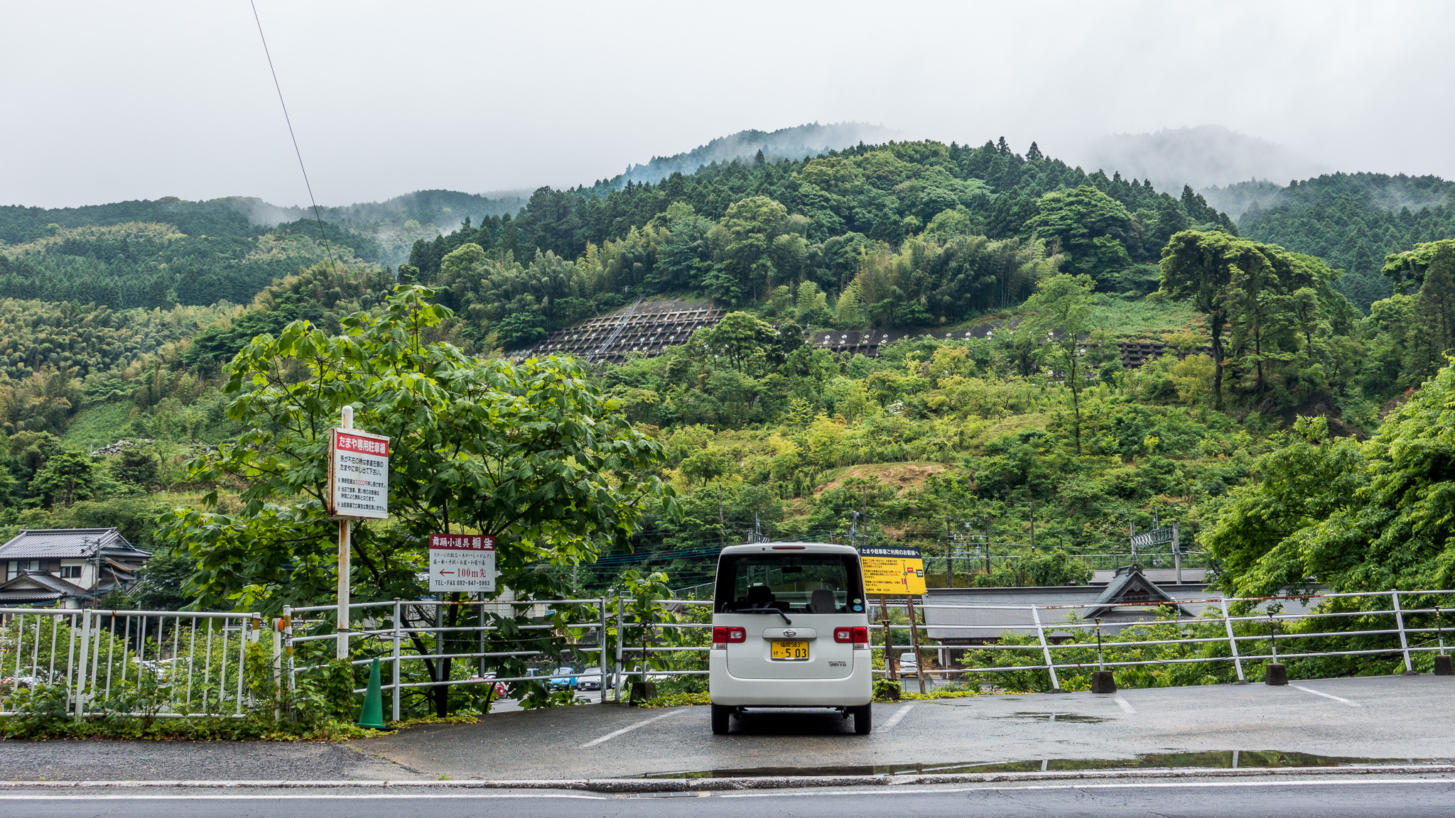
Second photo from Japan -

Third photo from Japan


<div class="n-carousel n-carousel--lightbox n-carousel--inline n-carousel--thumbnails n-carousel--vertical">
	<ul class="n-carousel__content">
		<li>
			<figure>
				<picture>
					<img width="1365" height="2048" src="DSC00756.jpg" loading="lazy">
				</picture>
				<figcaption>A city skyline</figcaption>
			</figure>
		</li>
		...
	</ul>
	<div class="n-carousel__index">
		<button><img src="DSC00756-88x88.jpg" alt="Thumbnail of a city skyline"></button>
		...
	</div>
</div>
1.67:1
-

First photo from Rīga -

Second photo from Rīga -

Third photo from Rīga


<div class="n-carousel n-carousel--lightbox n-carousel--aspect n-carousel--thumbnails" style="--ratio: 1">
	<ul class="n-carousel__content">
		<li>
			<figure>
				<picture>
					<img width="1365" height="2048" src="DSC00756.jpg" loading="lazy">
				</picture>
				<figcaption>A city skyline</figcaption>
			</figure>
		</li>
		...
	</ul>
	<div class="n-carousel__index">
		<button><img src="DSC00756-88x88.jpg" alt="Thumbnail of a city skyline"></button>
		...
	</div>
</div>
1.67:1 vertical
-
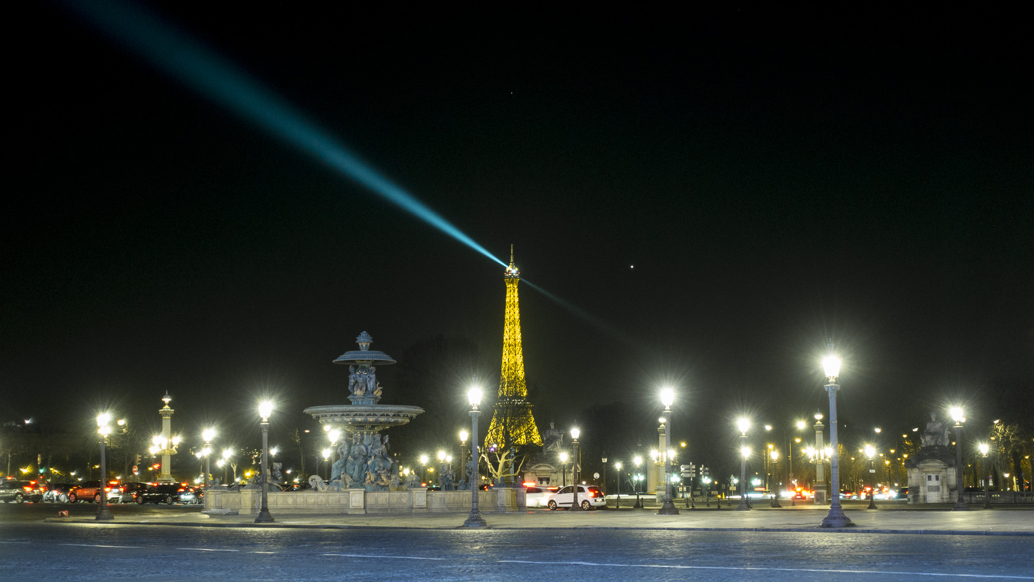
First photo from Paris -

Square -
Second photo from Paris -
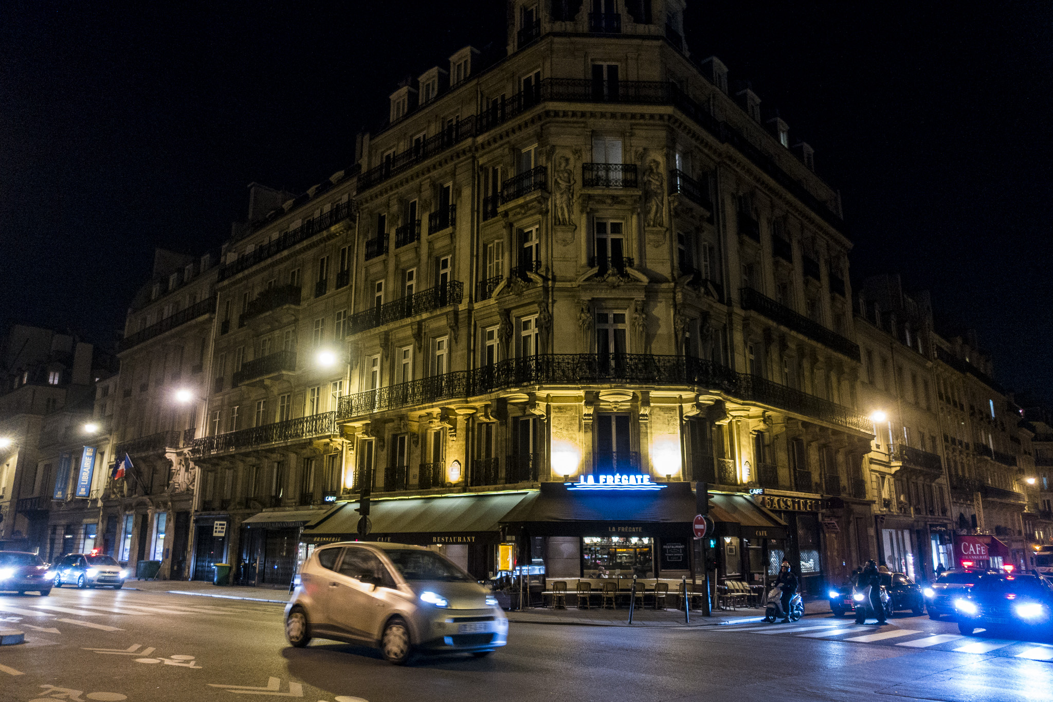
Third photo from Paris


<div class="n-carousel n-carousel--lightbox n-carousel--aspect n-carousel--thumbnails n-carousel--vertical" style="--ratio: 1.67">
	<ul class="n-carousel__content">
		<li>
			<figure>
				<picture>
					<img width="1365" height="2048" src="DSC00756.jpg" loading="lazy">
				</picture>
				<figcaption>A city skyline</figcaption>
			</figure>
		</li>
		...
	</ul>
	<div class="n-carousel__index">
		<button><img src="DSC00756-88x88.jpg" alt="Thumbnail of a city skyline"></button>
		...
	</div>
</div>
Detached nav
-
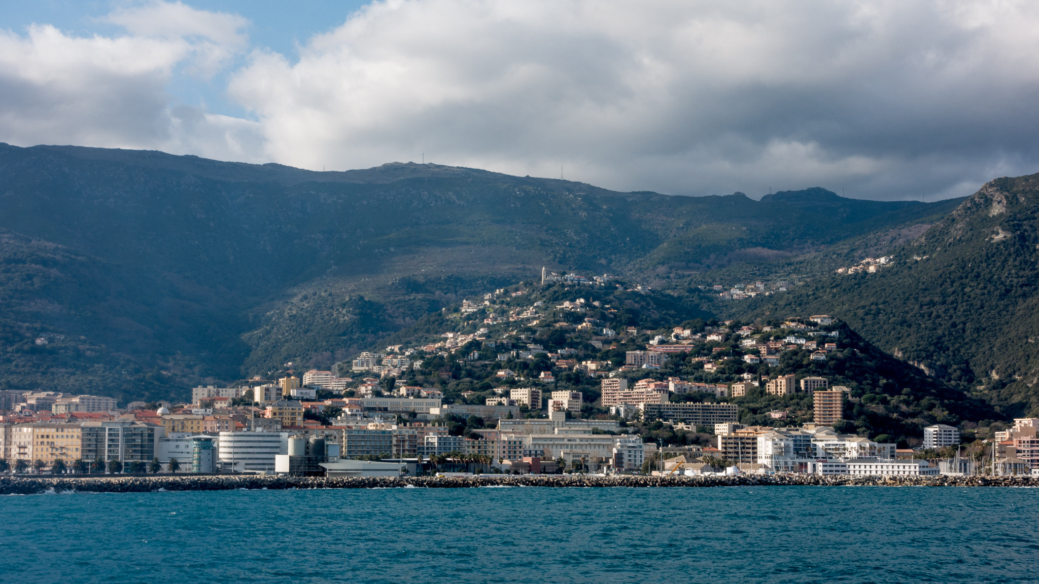
First photo from Corsica -

Second photo from Corsica -
Third photo from Corsica


<div class="n-carousel n-carousel--lightbox" id="carousel-detached">
	<ul class="n-carousel__content">
		<li>
			<figure>
				<picture>
					<img width="1365" height="2048" src="DSC00756.jpg" loading="lazy">
				</picture>
				<figcaption>A city skyline</figcaption>
			</figure>
		</li>
		...
	</ul>
</div>
<div class="n-carousel__previous" data-for="carousel-detached">
	<button><span>Previous</span></button>
</div>
<div class="n-carousel__next" data-for="carousel-detached">
	<button><span>Next</span></button>
</div>Peeking at neighboring slides
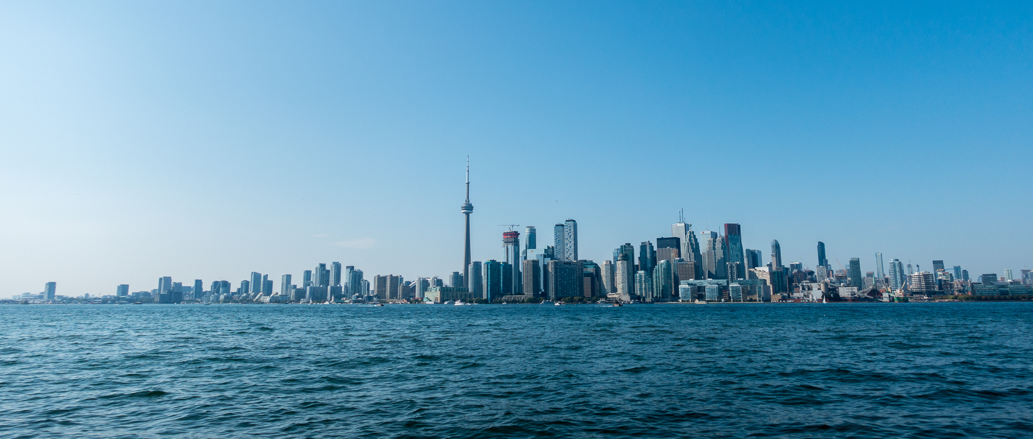
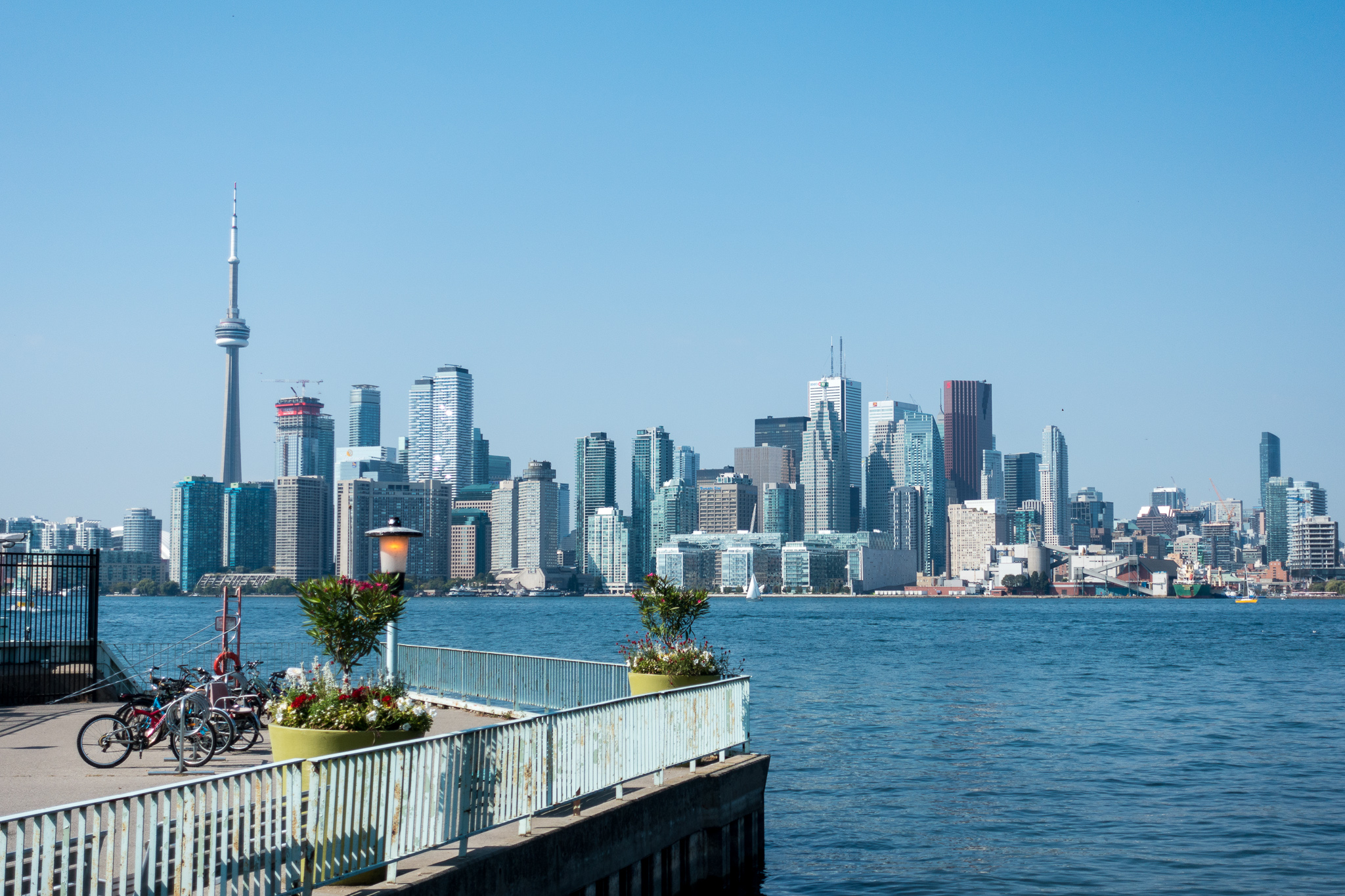
-
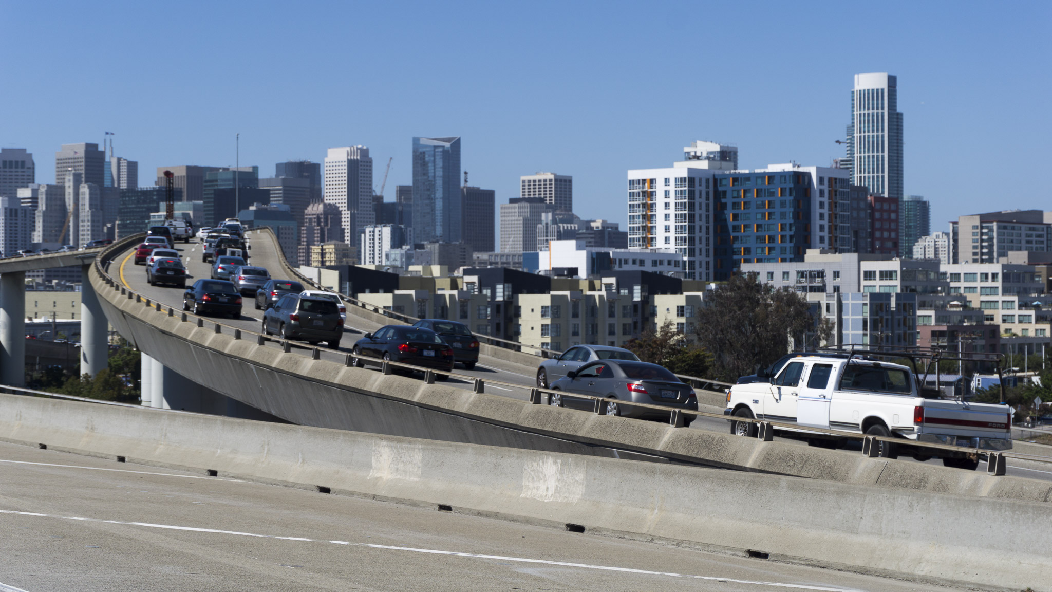
First photo from San Francisco -

Second photo from San Francisco -

Third photo from San Francisco


<div class="n-carousel n-carousel--lightbox n-carousel--peek n-carousel--thumbnails">
	<ul class="n-carousel__content">
		<li>
			<figure>
				<picture>
					<img width="1365" height="2048" src="DSC00756.jpg" loading="lazy">
				</picture>
				<figcaption>A city skyline</figcaption>
			</figure>
		</li>
		...
	</ul>
	<div class="n-carousel__index">
		<button><img src="DSC00756-88x88.jpg" alt="Thumbnail of a city skyline"></button>
		...
	</div>
</div>
Auto height
-
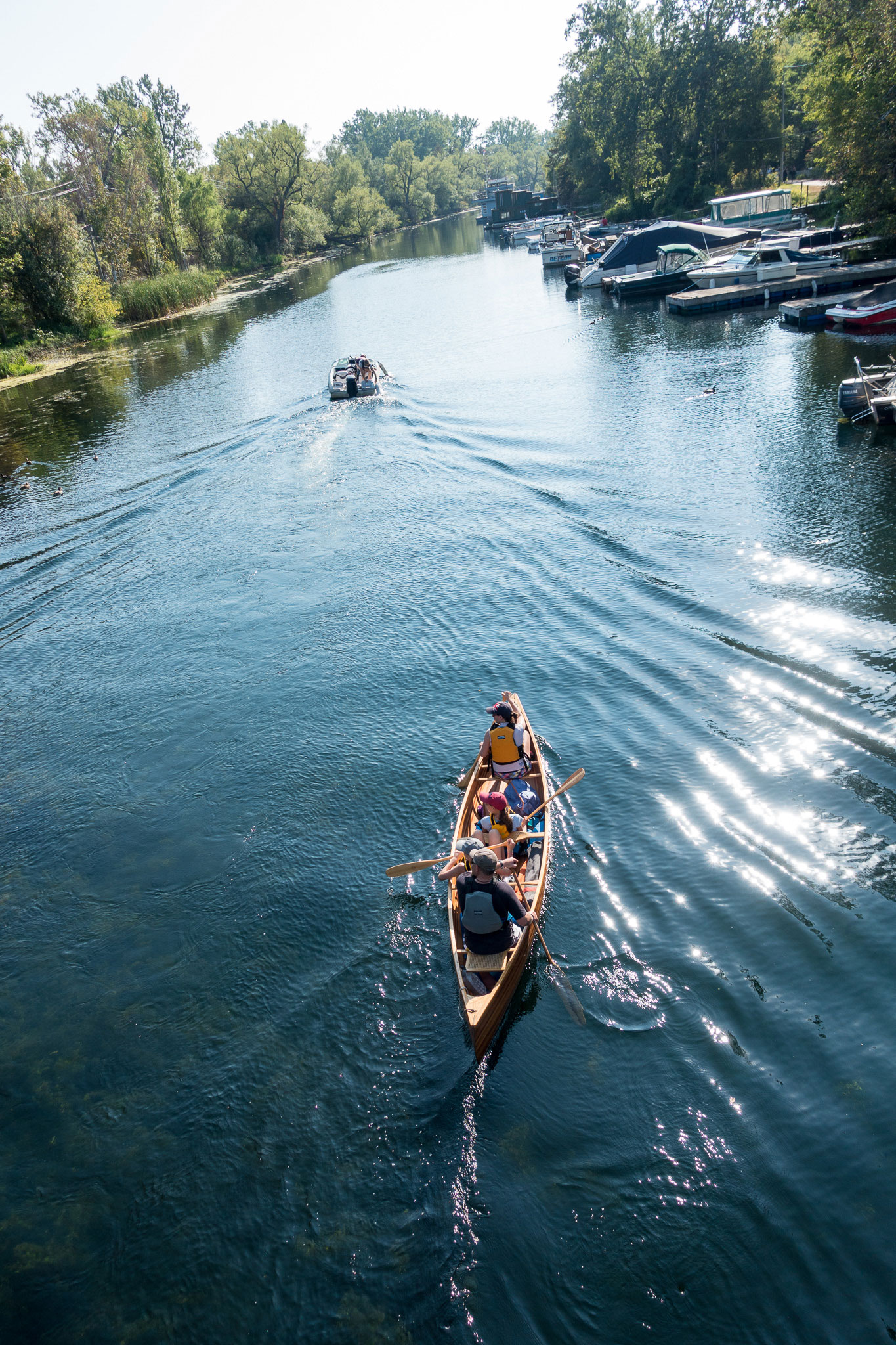
First Toronto photo -
Second Toronto photo -
Third Toronto photo


<div class="n-carousel n-carousel--lightbox n-carousel--auto-height n-carousel--thumbnails">
	<ul class="n-carousel__content">
		<li>
			<figure>
				<picture>
					<img width="1365" height="2048" src="DSC00756.jpg" loading="lazy">
				</picture>
				<figcaption>A city skyline</figcaption>
			</figure>
		</li>
		...
	</ul>
	<div class="n-carousel__index">
		<button><img src="DSC00756-88x88.jpg" alt="Thumbnail of a city skyline"></button>
		...
	</div>
</div>
Auto height – vertical
-
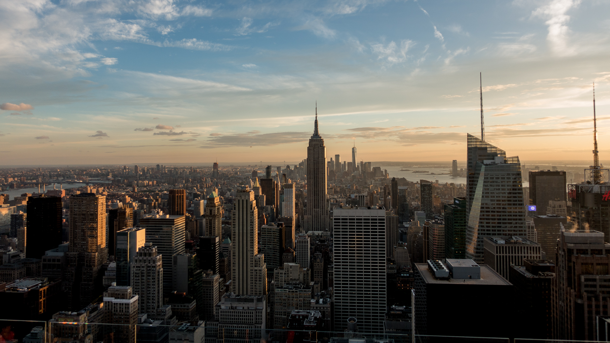
First New York photo -
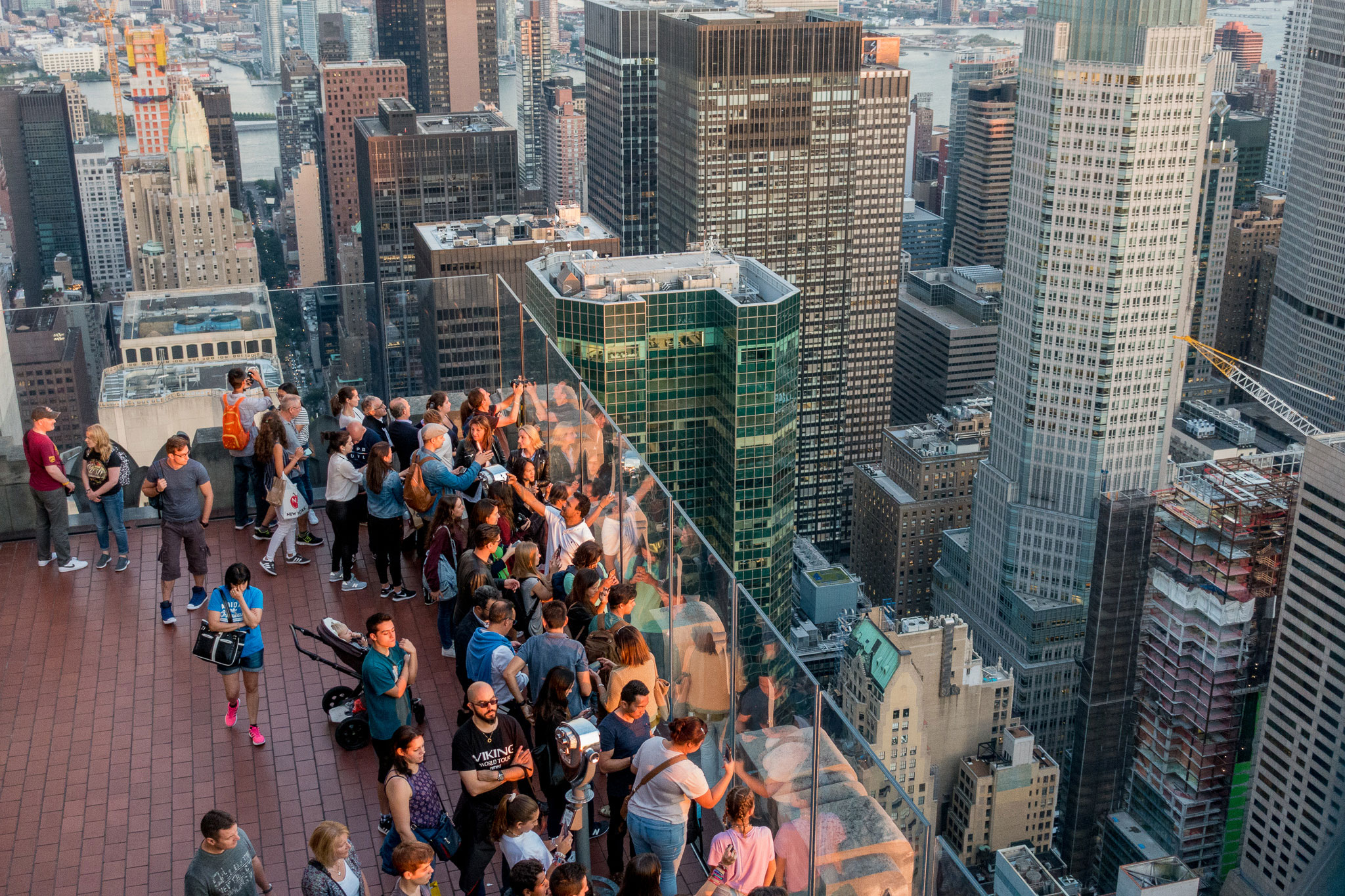
Second New York photo -
Third New York photo -

Fourth New York photo


<div class="n-carousel n-carousel--lightbox n-carousel--auto-height n-carousel--thumbnails n-carousel--vertical">
	<ul class="n-carousel__content">
		<li>
			<figure>
				<picture>
					<img width="1365" height="2048" src="DSC00756.jpg" loading="lazy">
				</picture>
				<figcaption>A city skyline</figcaption>
			</figure>
		</li>
		...
	</ul>
	<div class="n-carousel__index">
		<button><img src="DSC00756-88x88.jpg" alt="Thumbnail of a city skyline"></button>
		...
	</div>
</div>
Options
- This component inherits the carousel
Tables
Default
| TheTableWillBeScrollableOnNarrowScreensBecauseOfWideCell | One Time | Second Long col | Three | Four |
|---|---|---|---|---|
| B | 3 | ✔︎ | ✔︎ | ✔︎ |
| Row Two with Long Headline to Test Table on Narrow Screens | 1 | ✔︎ | ✔︎ | ✔︎ |
| A | 2 | ✔︎ | ✔︎ | ✔︎ |
<table class="n-table">
	<thead>
		<tr>
			<td>Head</td>
			...
		</tr>
	</thead>
	<tr>
		<td>First</td>
		...
	</tr>
	...
</table>
Wide
<div class="n-table--wide">
	<table class="n-table">
		<tr>
			<td>First</td>
			...
		</tr>
		...
	</table>
</div>Accordion
Lorem ipsum dolor sit amet, consectetur adipisicing elit, sed do eiusmod tempor incididunt ut labore et dolore magna aliqua. Ut enim ad minim veniam, quis nostrud exercitation ullamco laboris nisi ut aliquip ex ea commodo consequat. Duis aute irure dolor in reprehenderit in voluptate velit esse cillum dolore eu fugiat nulla pariatur.
<div class="n-accordion">
	<input type="checkbox">
	<h2 class="n-accordion__label"> <button> Accordion </button></h2>
	<div class="n-accordion__content">
		...
	</div>
</div>Content.
<div class="n-accordion">
	<input type="checkbox" checked="true">
	<h2 class="n-accordion__label" aria-expanded="true"> <button> Accordion </button></h2>
	<div class="n-accordion__content">
		...
	</div>
</div><div role="group">
<div class="n-accordion">
...
</div>
<div class="n-accordion">
...
</div>
...
</div>Lorem ipsum dolor sit amet, consectetur adipisicing elit, sed do eiusmod tempor incididunt ut labore et dolore magna aliqua. Ut enim ad minim veniam, quis nostrud exercitation ullamco laboris nisi ut aliquip ex ea commodo consequat. Duis aute irure dolor in reprehenderit in voluptate velit esse cillum dolore eu fugiat nulla pariatur.
Lorem ipsum dolor sit amet, consectetur adipisicing elit, sed do eiusmod tempor incididunt ut labore et dolore magna aliqua. Ut enim ad minim veniam, quis nostrud exercitation ullamco laboris nisi ut aliquip ex ea commodo consequat. Duis aute irure dolor in reprehenderit in voluptate velit esse cillum dolore eu fugiat nulla pariatur.
<div class="n-accordion">
	<input type="checkbox">
	<h2 class="n-accordion__label">
		<button>Title</button>
	</h2>
	<div class="n-accordion__content">
		<div class="n-accordion">
			...
		</div>
	</div>
</div>
Popin
<div class="n-accordion__popin" role="group">
	<div class="n-accordion">
		...
	</div>
	...
</div>
Mobile accordion
Lorem ipsum dolor sit amet, consectetur adipisicing elit, sed do eiusmod tempor incididunt ut labore et dolore magna aliqua. Ut enim ad minim veniam, quis nostrud exercitation ullamco laboris nisi ut aliquip ex ea commodo consequat. Duis aute irure dolor in reprehenderit in voluptate velit esse cillum dolore eu fugiat nulla pariatur.
<div class="n-accordion">
	<input type="checkbox">
	<h2 class="n-accordion__label"> <button> Accordion </button></h2>
	<div class="n-accordion__content">
		...
	</div>
</div>
Tooltip
This text has a tooltip.
Here is the tooltip
Lorem ipsum dolor sit amet, consectetur adipisicing elit, sed do eiusmod tempor incididunt ut labore et dolore magna aliqua, quis nostrud exercitation ullamco laboris nisi ut aliquip ex ea commodo consequat. Duis aute irure dolor in reprehenderit in voluptate velit esse cillum dolore eu fugiat nulla pariatur. Excepteur sint occaecat cupidatat non proident, sunt in culpa qui officia deserunt mollit anim id est laborum.
Lorem ipsum dolor sit amet, consectetur adipisicing elit, sed do eiusmod tempor incididunt ut labore et dolore magna aliqua, quis nostrud exercitation ullamco laboris nisi ut aliquip ex ea commodo consequat. Duis aute irure dolor in reprehenderit in voluptate velit esse cillum dolore eu fugiat nulla pariatur. Excepteur sint occaecat cupidatat non proident, sunt in culpa qui officia deserunt mollit anim id est laborum.
The tip will appear on the side of the tool with the most space available and won't be affected by overflow: hidden around the tool.
<span class="n-tooltip" aria-describedby="tooltip1">This text has a tooltip.<span class="n-tooltip__icon"></span></span>
<span class="n-tooltip__content" id="tooltip1" role="tooltip">Explanation</span>
Options
- Use
.n-tooltip__content { --nui-border-radius: .5em; }for rounded edges.
<button onclick="nui.modal('Content')" class="n-btn n-btn--big">Open a modal</button><a href="external.html#content" class="n-modal-link">Open a modal here.</a>Open a modal with custom animation.
<a href="external.html#content" class="n-modal-link" data-anim="0% { opacity: 0; } 100% { opacity: 1; }">Open a modal with custom animation.</a><a href="external.html#content" class="n-modal-link n-modal--full">Open a modal here.</a><button data-href="external.html#content?4" class="n-modal-link n-modal--shadow n-btn n-btn--big">Shadow</button><button data-href="external.html#content?5.html" class="n-modal-link n-modal--blur n-btn n-btn--big">Blur</button>Close a modal with nui.modal.close(element).
Lists
Ordered
- First item
- First item sub item 1
- First item sub item 2
-
Second item with a longer headline which shows what happens when there isn't enought space
An in-house study at Walmart.com came out with the results that saw an up to 2% increase in conversions on the site for every single second of improvement on the load time. The accumulative growth of revenues went up to 1% for every 100 milliseconds of load time improvement.
- Second item's sub item 1
- Second item's sub item 2 Second item's sub item 2 Second item's sub item 2
- Sub sub item
- Another sub sub itemAnother sub sub itemAnother sub sub itemAnother sub sub itemAnother sub sub itemAnother sub sub itemAnother sub sub itemAnother sub sub itemAnother sub sub item
Unordered
- Unordered one
- Unordered two
- Nested one
- Nested two
- Unordered three
Options
- ul.n-list--inline orders items on one line
- ul.n-list--indent for margin on the left
- ul.n-list--no-bullet for a clean list
- Set colors by CSS variables --nui-list-bg and --nui-list-color.
Forms
Default
Mast
<form class="n-form n-form--mast">
	...
</form>
Wide
<form class="n-form n-form--wide">
	...
</form>
Elements
Text input
<label>
	<span>Label</span>
	<input type="text">
</label>
Number input
<label>
	<span>Label</span>
	<input type="text" inputmode="numeric" pattern="[0-9]*" data-digits="5">
</label>
Checkbox
<label>
	<input type="checkbox"> <b class="n-form__check-icon"></b>
	Checkbox-specific label
</label>
Radio buttons
<fieldset>
	<legend>Label for all buttons</legend>
	<label>
		<input type="radio" name="radiodemo"> <b class="n-form__check-icon"></b>
		Label for this button
	</label>
	<label>
		<input type="radio" name="radiodemo"> <b class="n-form__check-icon"></b>
		Label for this button
	</label>
	...
</fieldset>
Textarea
<label>
	<span>Label</span>
	<textarea></textarea>
</label>
Range input
<label>
	<span>Label</span>
	<input type="range">
</label>
File input
<label>
	<span>Select a file</span>
	<div class="n-form__file">
		<input name="file" type="file">
		<span><span class="n-form__file-tag">Drop or browse</span></span>
	</div>
</label>
Select
<label>
	<span>Label</span>
	<select>
		<option value="First option">First option</option>
		<option value="Second option">Second option</option>
		...
	</select>
</label>
Rich select
Full info on standalone component home page.
<label>
	<span>Label</span>
	<div class="n-select">
		<select name="select1"> <!-- Optional -->
			<option>Option 1</option>
			<option value="2">Option 2</option>
			<option>Option 3</option>
		</select>
		<div class="n-select__options" data-name="select1">
			<button>Option 1</button>
			<button value="2">Option 2</button>
			<button>Option 3</button>
		</div>
	</div>
</label>
Optional section
<div class="n-form__check n-form__condition" data-for="conditional_fieldset">
	<span>Enable fieldset below</span>
	<label>
		<input type="checkbox"> <b class="n-form__check-icon"></b>
	</label>
</div>
<fieldset id="conditional_fieldset" disabled>
	...
</fieldset>
Optional fieldsets are ignored by validation when disabled.
Options
-
.n-form__condition
's optionalfieldset
is selected either by adata-for/id
match or as a following sibling. - Validation enabled by
<label class="n-form--mandatory">
- Set the placeholder colour with CSS variable --nui-placeholder-color.
-
<form class="sticky-submit">
to position the submit button absolutely on the right/center. -
<textarea data-auto>
for automatically adjusted textarea height. -
data-digits=x
– required digits in a number input - The rich select can be used outside of a form without label. It can also contain links instead of option buttons. More info.
Colors for input and textarea
.n-form input, .n-form textarea {
	--nui-input-color: darkslateblue;
	--nui-input-bg: aliceblue;
}
Masonry
Vertical track only.
<div class="n-masonry">
	<div>Item</div>
	...
</div>
Cards
Standard
Card content.
Link ninth.<div class="n-card">
<div class="n-card__content"> Content </div>
</div>Card with headline
Title
Card content.
Link tenth.<div class="n-card">
<div class="n-card__head"> Headline </div>
<div class="n-card__content"> Content </div>
</div>Card with image
Card content.
Link eleventh.<div class="n-card">
<img src="image.jpg" alt="Image">
<div class="n-card__content"> Content </div>
</div>Card with headline and image
Title
Card content.
Link twelfth.<div class="n-card">
<div class="n-card__head n-card__head--image" style="background-image: url(image.jpg)"> Headline </div>
<div class="n-card__content"> Content </div>
</div>Options
- CSS variable
--nui-card-bg
specifies the background colour.
Parallax scrolling
<div class="n-parallax">
	<div class="n-parallax__content"> ... </div>
</div>
Offset relative either to scrolling parent or body.
Notification bar
<body>
    <div class="n-notify"> Message </div>
    ...
</body>
or
document.body.insertAdjacentHTML("afterbegin", "<div class='n-notify'> Message </div>");or
nui.notify("Message");Options
-
nui.notify("Text", "timeout")to hide it automatically after 2 seconds
Copy to clipboard
Text to be copied to clipboard.
nui.copyButton(document.getElementById("copybutton"), document.getElementById("copycontent"));Options
- Add a third parameter to echo the content in a notification bar
Dynamic components
nui.addComponent(host, `<div class="n-carousel">
	<div class="n-carousel__next">
		<button><span>Next</span></button>
	</div>
	<div class="n-carousel__previous">
		<button><span>Previous</span></button>
	</div><div class="n-carousel__content"><div>New</div><div>Carousel</div></div>
</div>`);
Dynamically added component HTML will be automatically initialised by a mutation observer, which can be disabled by
nui.dynamicInit = false;
Theme
:root {
	--nui-bg: black;
	--nui-color: white;

	--nui-control-bg: lightcoral;
	--nui-control-color: white;
	--nui-control-active-bg: #cc7c7e;
	--nui-control-active-color: #eee;
	--nui-control-highlight: #bf2a2a;

	--nui-input-color: darkslateblue;
	--nui-input-bg: aliceblue;

    --nui-list-bg: aquamarine;
    --nui-list-color: darkmagenta;

	--nui-bg-dark: white;
	--nui-color-dark: black;

	--nui-control-bg-dark: lightcoral;
	--nui-control-color-dark: white;
	--nui-control-active-bg-dark: #cc7c7e;
	--nui-control-active-color-dark: #eee;
	--nui-control-highlight-dark: #bf2a2a;

	--nui-input-color-dark: darkslateblue;
	--nui-input-bg-dark: aliceblue;

	--nui-list-bg-dark: aquamarine;
	--nui-list-color-dark: darkmagenta;

	--nui-border-radius: .5em;

	--nui-border-size: 1px;
	--nui-border-color: darkgreen;
	--nui-border-color-dark: lightgreen;

	--nui-shadow-size: 1px;
	--nui-shadow-blur: 3px;
	--nui-shadow-color: red;
	--nui-shadow-color-dark: pink;
}- The default scheme is Light
-
.n-scheme-dark
uses Dark scheme -
.n-scheme-auto
uses Auto scheme - Borders are done with box shadow, to avoid layout difference between elements with and without borders.